Sunday, 1 March 2015


Thursday, 26 February 2015
Plans I Didnt Follow
Plans I didn't follow
The most obvious decision that I wasn't able to follow
was the drawn up plans I had made as an over view of what my finished products would
have looked at. The main reason that I think I didn't stick to these drawing is
because of how simple they looked. I don’t think that I included nor had a
clear idea of how much I would actually need to put into each of them.
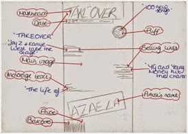 For my front cover drawn plan I included quite a few
conventions such as masthead, puff and selling lines. However when it came to actually
producing it I wasn't able to include all of them, I was probably thinking that
the front cover would look too informative on just one page and decrease its
professionalism. Therefore I didn't include the puff and instead added more selling lines as that is key for a front cover page as well as a ‘plus’. The
main reason for this was, because of the magazines that I had used for
inspiration all had clean cut images. For this reason, I too wanted my magazine
to have a clean cut image for its brand, which I also think is good for my
target readers as they are young adults, I didn't think that a lot of information would be needed. As you get older I think that interpreting what
the magazine is about comes easier. For example if Jay Z is on a magazine the magazine
is more likely to also include his daughter or Beyoncé and therefore the selling lines would need to be put on. However for if
it’s a magazines for young children then more would need to be put on the front
in order to keep them interested.
For my front cover drawn plan I included quite a few
conventions such as masthead, puff and selling lines. However when it came to actually
producing it I wasn't able to include all of them, I was probably thinking that
the front cover would look too informative on just one page and decrease its
professionalism. Therefore I didn't include the puff and instead added more selling lines as that is key for a front cover page as well as a ‘plus’. The
main reason for this was, because of the magazines that I had used for
inspiration all had clean cut images. For this reason, I too wanted my magazine
to have a clean cut image for its brand, which I also think is good for my
target readers as they are young adults, I didn't think that a lot of information would be needed. As you get older I think that interpreting what
the magazine is about comes easier. For example if Jay Z is on a magazine the magazine
is more likely to also include his daughter or Beyoncé and therefore the selling lines would need to be put on. However for if
it’s a magazines for young children then more would need to be put on the front
in order to keep them interested.

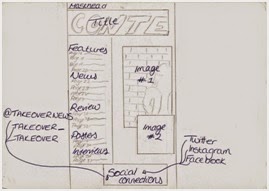 I would have
to say that my contents page was the page that I had the most time struggling
with. I knew from the beginning that once I couldn't find the right picture to
use for my content page that I would be able to stick with the plan. At first I
planned on on having one picture on the side with text all around it, but then
afterwards I started finding it hard to choose a background color. Therefore I
decided to do some research and found out that most pictures taken by professional
as use the background they've been given and just edit it, to make it brighter
or fit the concept, which is what I decided to do. This also meant that I couldn't stick to the planned schedule I had made either as I had to recall the
model I had used and retake some pictures. Once I had decided to use the
background from the picture, because of the position of my model in the photo I
had to also change the position of the text I would later on include.
I would have
to say that my contents page was the page that I had the most time struggling
with. I knew from the beginning that once I couldn't find the right picture to
use for my content page that I would be able to stick with the plan. At first I
planned on on having one picture on the side with text all around it, but then
afterwards I started finding it hard to choose a background color. Therefore I
decided to do some research and found out that most pictures taken by professional
as use the background they've been given and just edit it, to make it brighter
or fit the concept, which is what I decided to do. This also meant that I couldn't stick to the planned schedule I had made either as I had to recall the
model I had used and retake some pictures. Once I had decided to use the
background from the picture, because of the position of my model in the photo I
had to also change the position of the text I would later on include. 
Producing the
double page spread was the easiest part for me, I think I was able to keep to the drawn plan I
had and include some things here and there. For example sticking to the position of where to place the interview of my featuring artists as well as well image
to go behind as the background as well, managed to fit fit perfectly together.
Tuesday, 24 February 2015


Wednesday, 18 February 2015
Front Cover Editing
Front Cover Editing
In order to make my front cover more appealing, all I had
left to do was add some more selling lines towards the top side of the models
face, this way the page will look more full and informative. I also researched
and saw that on the front cover that I used as inspiration; most front covers
had puffs or a plus. When it came to deciding where on my front cover the
‘Plus’ text was going to go; I firstly went with positioning it just above
‘AZALEA’. However the background was of my models body warmer was black and
therefore clashed with the

Subscribe to:
Posts (Atom)