Thursday 29 January 2015

Double Page Editing

DOUBLE PAGE EDITING

When it came to my double page spread I found extremely hard, this is because whilst I was taking my pictures I didn't know at the time that I had to take pictures that had space on one side of them for the actual text. Later on I found out that there was something that I could on Photoshop that would allow me to stretch the background of my picture, making it suitable for a double page spread 
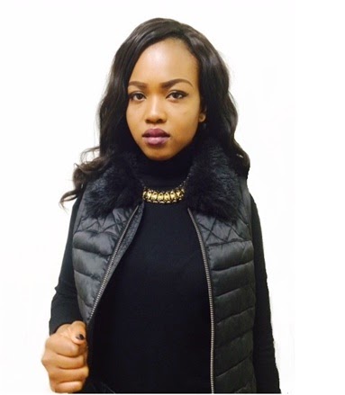
image. When it came to editing my picture I found an effect that would make my photo look more artistic toward more music genre. However when I used the effect it showed up like this:


 The problem with this is that I don’t think that it as effective as the readers wouldn't actually be able to see the models face in this image. So I decided to use some of the wall above the models head in order 
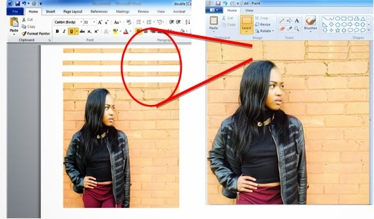
to see the models face I when I use the effect again. I used Microsoft Word to copy and paste 3 layers of the wall onto the top, and then grouped all of the together onto Paint in order to save he image as one.

 
After creating the background with the extra layers added on top, I was also able to stretch out the side of the image as I realized that I hadn't taken a correct picture where there is enough room on either side of my model to actually put the text. I decided to use this final effect on my picture as it 
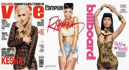
made the model fit into the genre off my magazine: where the artist is seen with a facial expression that relates to their music. I also done some research and realized that double page spreads in every magazine are completely different to the rest of the magazine, therefore I wanted this page to stand out by making it look more artistic, in a way.

Cover Page Editing

COVER PAGE EDITING

After coming to a conclusion on the pictures I’m going to use, I decided to keep a track on how I came about editing my pictures to fit the magazines genre.
I decided to use an online website to tint the picture slightly, making the background look a little bit grey I thought that this would make my model’s expression stand out more, making her look more serious. However i then done some research about the type on background color that is most often chosen, and for hip hop especially female artists it tends to be white. As seen from the photos of magazine covers below, the white background firstly makes it stand out to readers and catch their attention. As well as helping the artists themselves to stand out also. The white background helps to create a sense of wealth with high standards, yet powerful as the color also emphasizes their facial expressions:
Unfortunately behind my model there was also a door knob in the picture, which I had to cover with the background original color and then blend it in with the rest.

I decided to also to get rid of the shine in the picture as well as on my models face, this way the picture with look more professional and taking in a studio with the right equipment. Since this picture is for my front cover I also made some more space on the right side of my model so that there would be enough room to fit some text in.

Wednesday 21 January 2015

My Photoshoot

The Photo Shoot
Where it came to actually taking the picture for my magazine, I wanted the lighting to be bright so I therefore asked people on social media as well as email to as for their opinions on my location as well as the time of day that would be best for the pictures.


Based on the opinions I received from people, I decided to take some of the pictures in a near by park as most of the people I asked had mentioned that there is quite a few spots where graffiti can be seen. They also mentioned that I should take my pictures in my house, just in case the pictures taken outside don't capture the lighting as good.

Once looking through my pictures I did notice some things that were going wrong such as the weather on the actual day wasn't as good as I had hoped since it was a bit too cloudy. There was also a lot of wind on the day and therefore the models hair was blowing all over the place


Monday 19 January 2015

Drawn Plan: Double Page Spread

Drawn Plan: Double Page Spread
When drawing the plan for my cover page I decided to follow up on my research and go by some of the conventions used for other magazines that have been published. For my double page spread I intend the typical conventions such as arranging the page’s text in columns which are usually 3 or 4. The Model I had been taking pictures of, will be across both pages but mainly on the left hand side to make the two pages look more like a poster. I decided to have mine located on the left pages stretching over to the right. I was going to use Quotes for my double page spread, however since the content will be almost like questions and answers, I decided not to use pull out quote. I will be including a stand first paragraph, which will introduce the article and will be positioned at the beginning of the headline. The journalist name will also be at the end of the article to bring it to a professional close. Even though the article will be just questions and answer, I will be using a drop capital at the beginning of my stand first paragraph. At the top right hand corner I’ll also be adding in a by-line which will tell the readers who wrote the article, as well as photographer’s credit. In order to grab the reader’s attention even more and keep them interested I thought it would be best to write the article informally and that way it’ll seem more personal.


Drawn Plan: Contents Page

Contents Page
My contents page will have the page numbers on the pictures which anchors them to the written text on a certain page. As well as the name of the magazine will be located in the top left side corner, which would be represented as the magazines logo through the pages, on top of the issue date and the word contents. At the bottom I decided to add in subscription, contact information and some social connections such as Facebook, Instagram and Twitter. The actually contents will be divided into categories and headings used to identify each category. For the color scheme of my contents page, I’ll be following the colors on my cover page. This way my music magazine will look more professional as the page will sync in with each other.


Drawn Plan: Cover Page

Cover Page Conventions
The photograph on my cover page will be a medium close-up or mid shot, giving the audience a sense of directs address. I’ll also be including a puff towards the right hand side of y model, which would be offering something else to the magazine such as free giveaways or 50 new songs. I was even considering to use a buzz line which is used to attract attention ,this will be positioned at the bottom right. Along with it will sometimes be the date/month of edition, price, website and issue number. Cover lines will be used to attract the audience’s attention and make them pick the magazine up and look inside. The main cover line will be the largest text on the cover after the title and it anchors the meaning of the image, I could even use a sub line in smaller text giving more information about the article. The other cover lines are going to be one or two words with sub lines explaining them. These are used to intrigue the reader. These will represent the stories inside. There are only 5 or 6 and they are positioned down the sides, framing the image, so the main image is not covered. These are going to be  the same font to create a distinctive design.


Friday 16 January 2015

Typography

My Typography

For my front cover I decided to use sans serif for all the text including the Masthead and Cover Lines, this is because from some research I realize that sans serif fonts are usually easier to read works than serif fonts. Sans serif fonts also make the individual letters more distinctive and easier for our brains to recognize quickly. The use of sans serif fonts is because the near-uniform width of the strokes keeps the font readable when reduced in resolution or reduced in font size. Because sans serif fonts are more legible from farther away, this will make it easier for my magazine to be read and recognized from far away for my intended audience.


After finding some suitable sans serif fonts I couldn't decide from there which one to choose, so I therefore asked some people for their opinions of which one they thought I should choose. Here are some of the answers:


From the messages I received from people, I decided to use the second sans serif font for the masthead, the cover lines, date and the text in the magazine. I also decided to do the same for my model’s name as I found 3 different fonts, but they were also similar in my opinion that I couldn't choose.


From the opinions I received from people, I decided to go with the second font which would be for my models name located on the cover page as well as the double page spread.


I also decided to use sans serif font for my contents page as well, since from most research I have read there were paragraphs on how sans serif fonts are easier to inform pole on things. A for my contents page, it will be showing my readers what most of the pages will be showing , since it’s know that sans serif makes the brain for my intended audience believe its less boring, as serif fonts tend to be for more important information. For this reason, I’ll be making the text on my double page spread serif, which will also emphasise that this is the main story of the magazine.

Wednesday 14 January 2015

Costume and Makeup


Costume & Makeup

Since the genre of my magazines is Hip Hop, I decided to make my model look more empowering and make sure that her jewellery is clearly showing, since jewellery is clear key point for Hip Hop and R&B. As you can see from both the boots and the boots there’s there’s the colour gold, this colour, especially in Hip Hop, gold seems to be a representative of money and success. Female star images are always eye catching and very dramatic. Their makeup is also very bold and defined, especially their eyes they always have dark colored eye shadow which makes their eyes look more powerfully. To show power some females wear either red or dark colored lipstick. I also wanted to model to seem more dominant, therefore I decided to include some dark lipstick, I think through the close up pictures I’ll be taking this’ll be emphasised.
Both boots and the crop top, connote a type of strong grown women, which is the type of women I wanted my model to represent. I mange dot get this idea from looking at previous magazine covers, since every celebrity is ever looking directly at the camera with a strong glare or looking down at the camera, but in whichever picture it was they had their makeup and clots done similar to the ones that I have picked out.

Monday 5 January 2015

Conventions


Conventions
On my front cover the name of my featuring artists in the magazine will be represented in big clear bold letters.  The eye flow of my magazine cover will be directly down the centre from the top right hand side of the masthead, which would lead to them seeing the artists name at the bottom.   I’ll include selling lines as a way of telling the readers about other articles in the magazine as well as another way of actually selling my magazine if the featuring celebrity isn’t enough. There will also be anchorage text on both my front cover and throughout my magazine. This will relate the images being displayed to the actual text, telling the readers some side information of what the picture are. The main image on my cover page, contents page and double page spread will all be related to one another, this’ll allow my magazine to flow much more easily as well as keep in the reader’s mind of who the actual featuring celebrity is. Since the price of my magazine is quite high I done some research and found out that most magazine writers who have published their expensive tend to have their prices smaller than usually. Since the size depends on the actual price of the magazine I decided to make my price a little smaller next to the barcode.  I also wanted to include a puff lines on my cover page which will give some extra information about the content in the magazine, on top of that I’ve seen on previous magazine covers that the puff lines are usually put in a shape to make it stand out compared to everything else on the cover page.

Location and Pictures


Location & Pictures

The locations I have decided to use for my cover pictures were my house, the reason for this is because if i were to do it outside and then again another day the lighting wouldn’t be the same therefore because the lighting in the house was good, I decided to stay at home for my first couple of pictures. After these I then decided to go behind my friend’s house as there are some graffiti wring that I could use as the models background which would also help emphasis the genre of my magazine. Finally there were also some slight costume changes were my model is wearing a tight black top with a black and gold chain, to a oversized jacket.
From research that I’ve done some females artists covers on music magazines will portray themselves how males do in there, usually to convey a message to their audience – musicians who have famously done this for magazines are Ciara and BeyoncĂ©. In my coursework I will also be challenging the usual portrayal of females on my magazine cover, where the woman is shown as the more powerful person. The common ways to do this is through costume and lighting, because a change in the way women are dressed can make them seem powerful automatically – although I will still stick to dressing the artist in the usual “skimpy” clothing, I will use colour stereotypes for example black clothing to show them as powerful.

Photo Shoot Plan


Date
Plan
Reason
20/12/14
Saturday
-Make sure i have all the makeup and outfits ready
- The correct jewellery
-Check with my model to make sure she can still make it
-Locations are still okay to be used?
-To make sure everything is ready
-No mistake being made
21/12/14
Sunday
-Taking first set of pictures
-Using mirror for split camera
-Model wearing black tight turtle neck, black fur body warmer, skinny jeans and black boots
-Make up done; dark lips, smoky eyes
-GOLD AND BLACK CHAIN
-For my magazine cover
-Want to start from the front, work my way to the double page spread
-Decided to use a mirror to see both halves of the models face make eye contact with the camera (i think it could look nice with and effect)
 
22/12/14
Monday
-Taking second set of pictures
-Change of outfit: OVERSIZED JACKET
-(same makeup)
-Looking away and walking towards camera
-Different angles from when using chair
-GOLD AND BLACK CHAIN
-Sometimes female rappers wear boyish cloths or baggy cloths
-Same makeup is to show consistency through the magazine
-Chair is a prop: to get pictures for different angles
23/12/14
Tuesday
-Taking third set of pictures
-Looking straight at camera
-(same makeup)
-NO JACKET OR BODY WARMER
-GOLD AND BLACK CHAIN
-Gold chain always included: sign of money
-More relaxed photo shoot, simple outfit but powerful pictures because model will look straight at the camera
-Serious look at the camera to make eye ‘contact with’ the readers