Tuesday, 7 April 2015


What have you learnt about technologies from the process of constructing this product?
 Photoshop is an editing software manufactured
by Adobe Systems Inc. Whilst using this software I realised that it
allows users to manipulate and correct the colour on photos.
Photoshop opened my eyes to how many professionals are able to edit out
many of their mistakes without any of their audience realizing. However it
was a
very long process to get the handle of; from selecting a different layer each
time, to applying any effect I may have added. There were many tools on
Photoshop that I had to get used to in order to perfect my skills. 2 of the
main tools that I think I used the most were the ‘Move Tool’ and the ‘Magic
Wand Tool’. Since i was always inserting objects, I had to become an expert at
what these two tools could do. As well as the outline tool that let me cut out
bits of an image that I didn't want included. I have to think that
Photoshop was the software that most of my music magazine was made, and has
helped me greatly makes my magazine seem more professional.
Photoshop is an editing software manufactured
by Adobe Systems Inc. Whilst using this software I realised that it
allows users to manipulate and correct the colour on photos.
Photoshop opened my eyes to how many professionals are able to edit out
many of their mistakes without any of their audience realizing. However it
was a
very long process to get the handle of; from selecting a different layer each
time, to applying any effect I may have added. There were many tools on
Photoshop that I had to get used to in order to perfect my skills. 2 of the
main tools that I think I used the most were the ‘Move Tool’ and the ‘Magic
Wand Tool’. Since i was always inserting objects, I had to become an expert at
what these two tools could do. As well as the outline tool that let me cut out
bits of an image that I didn't want included. I have to think that
Photoshop was the software that most of my music magazine was made, and has
helped me greatly makes my magazine seem more professional.
InDesign was the
hardest program I used during my magazine creation, although
I didn't use it as much as
Photoshop. Adobe InDesign is a desktop publishing software
application; it can be used to create posters, magazines,
newspapers. Whilst suing InDesign I realised that it was the perfect
software for applying text to any picture of background. It allows the text of
my music magazine to seem more realistic, through the layout and structure.
With the help of the guidelines I was able to insert on my front cover the
cover lines where all align with each other on both sides of the page, making
it seem more professional.

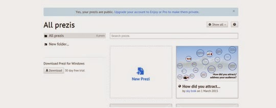 A popular website I was able to find online was
‘PicMonkey’. PicMonkey is an online editing website which allows uploading any
image from your computer and editing them with a given range of effects. I
think that this website gave me and escape from Photoshop, and was a quick and
simple way of quickly edit an image that I thought needed to be portrayed
differently to my target readers. Once i had edited my images, PicMonkey also
gave me the option to share or save the image, I decided to do both on social
media, this gave me the feedback I needed, whether the effect that I had chosen
was a good choice or not.
A popular website I was able to find online was
‘PicMonkey’. PicMonkey is an online editing website which allows uploading any
image from your computer and editing them with a given range of effects. I
think that this website gave me and escape from Photoshop, and was a quick and
simple way of quickly edit an image that I thought needed to be portrayed
differently to my target readers. Once i had edited my images, PicMonkey also
gave me the option to share or save the image, I decided to do both on social
media, this gave me the feedback I needed, whether the effect that I had chosen
was a good choice or not.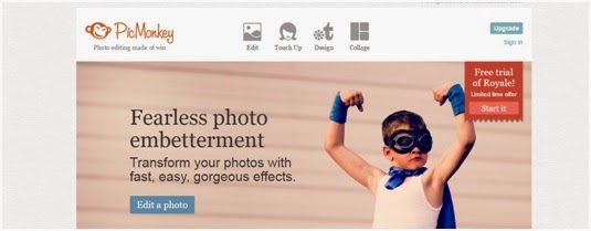 When it came to presenting my evaluation in various ways,
Prezi was a presentation website that I had come across, which allowed me to
display my work in an eye-catching mind map. I think that Prezi also helped me
a lot, as it enables the readers the say interested through the different
designs and colour of my own choice. With the help of Prezi I
was also able to upload images that would help the readers imagine what the
context is about or trying to portray. After making the mind map I was
fortunately given the options to share and save my mind map which would allow
any other person interested in media, which thought as a great way of expanding
its target market.
When it came to presenting my evaluation in various ways,
Prezi was a presentation website that I had come across, which allowed me to
display my work in an eye-catching mind map. I think that Prezi also helped me
a lot, as it enables the readers the say interested through the different
designs and colour of my own choice. With the help of Prezi I
was also able to upload images that would help the readers imagine what the
context is about or trying to portray. After making the mind map I was
fortunately given the options to share and save my mind map which would allow
any other person interested in media, which thought as a great way of expanding
its target market.
Blogger was the main source of keeping track of all of my
work, it help me whenever I didn't know what was needed to be done or even what
had been done already. It was a checklist of my progress, and showed me how to
publish my work online. I was also able to categorize my work into
subheading, such as homework and class work, which helped a lot when it
came to fine missing work that had to be completed. I was also found out how to
make various blogs depending on the content I could even give them different
titles and URLs.
Sunday, 1 March 2015

Thursday, 26 February 2015
Plans I Didnt Follow
Plans I didn't follow
The most obvious decision that I wasn't able to follow
was the drawn up plans I had made as an over view of what my finished products would
have looked at. The main reason that I think I didn't stick to these drawing is
because of how simple they looked. I don’t think that I included nor had a
clear idea of how much I would actually need to put into each of them.
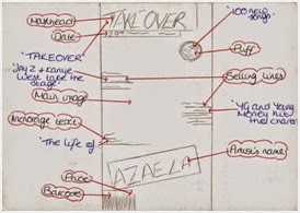 For my front cover drawn plan I included quite a few
conventions such as masthead, puff and selling lines. However when it came to actually
producing it I wasn't able to include all of them, I was probably thinking that
the front cover would look too informative on just one page and decrease its
professionalism. Therefore I didn't include the puff and instead added more selling lines as that is key for a front cover page as well as a ‘plus’. The
main reason for this was, because of the magazines that I had used for
inspiration all had clean cut images. For this reason, I too wanted my magazine
to have a clean cut image for its brand, which I also think is good for my
target readers as they are young adults, I didn't think that a lot of information would be needed. As you get older I think that interpreting what
the magazine is about comes easier. For example if Jay Z is on a magazine the magazine
is more likely to also include his daughter or Beyoncé and therefore the selling lines would need to be put on. However for if
it’s a magazines for young children then more would need to be put on the front
in order to keep them interested.
For my front cover drawn plan I included quite a few
conventions such as masthead, puff and selling lines. However when it came to actually
producing it I wasn't able to include all of them, I was probably thinking that
the front cover would look too informative on just one page and decrease its
professionalism. Therefore I didn't include the puff and instead added more selling lines as that is key for a front cover page as well as a ‘plus’. The
main reason for this was, because of the magazines that I had used for
inspiration all had clean cut images. For this reason, I too wanted my magazine
to have a clean cut image for its brand, which I also think is good for my
target readers as they are young adults, I didn't think that a lot of information would be needed. As you get older I think that interpreting what
the magazine is about comes easier. For example if Jay Z is on a magazine the magazine
is more likely to also include his daughter or Beyoncé and therefore the selling lines would need to be put on. However for if
it’s a magazines for young children then more would need to be put on the front
in order to keep them interested.

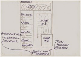 I would have
to say that my contents page was the page that I had the most time struggling
with. I knew from the beginning that once I couldn't find the right picture to
use for my content page that I would be able to stick with the plan. At first I
planned on on having one picture on the side with text all around it, but then
afterwards I started finding it hard to choose a background color. Therefore I
decided to do some research and found out that most pictures taken by professional
as use the background they've been given and just edit it, to make it brighter
or fit the concept, which is what I decided to do. This also meant that I couldn't stick to the planned schedule I had made either as I had to recall the
model I had used and retake some pictures. Once I had decided to use the
background from the picture, because of the position of my model in the photo I
had to also change the position of the text I would later on include.
I would have
to say that my contents page was the page that I had the most time struggling
with. I knew from the beginning that once I couldn't find the right picture to
use for my content page that I would be able to stick with the plan. At first I
planned on on having one picture on the side with text all around it, but then
afterwards I started finding it hard to choose a background color. Therefore I
decided to do some research and found out that most pictures taken by professional
as use the background they've been given and just edit it, to make it brighter
or fit the concept, which is what I decided to do. This also meant that I couldn't stick to the planned schedule I had made either as I had to recall the
model I had used and retake some pictures. Once I had decided to use the
background from the picture, because of the position of my model in the photo I
had to also change the position of the text I would later on include. 
Producing the
double page spread was the easiest part for me, I think I was able to keep to the drawn plan I
had and include some things here and there. For example sticking to the position of where to place the interview of my featuring artists as well as well image
to go behind as the background as well, managed to fit fit perfectly together.
Tuesday, 24 February 2015


Wednesday, 18 February 2015
Front Cover Editing
Front Cover Editing
In order to make my front cover more appealing, all I had
left to do was add some more selling lines towards the top side of the models
face, this way the page will look more full and informative. I also researched
and saw that on the front cover that I used as inspiration; most front covers
had puffs or a plus. When it came to deciding where on my front cover the
‘Plus’ text was going to go; I firstly went with positioning it just above
‘AZALEA’. However the background was of my models body warmer was black and
therefore clashed with the

Monday, 16 February 2015
Contents Page Editing
Contents Page Editing
In order for my contents page
and cover page to flow I decided to add the similar background covers for my
subheadings, and got rid of the black line at the bottom. After a while I didn't feel it was necessary that I had it, I think I was trying to make sure that
both my content page and double page spread flowed together nicely, however later
on I realised that my double page spread is the page which is supposed to stand
out the most as it contains the featuring artists on it. I also decreased the size
of my fonts, this way I can add more text onto the page and make it seem more
informative. Although when it came

Front Cover Editing
The final things
that I wanted to add to my front cover page were the saturated red around my headlines.
This way it’ll be easier for the reader’s to identify what the main content of
the magazine will be. I also edited ‘The Queen of Hip Hop’, giving it an outer glow;
this was because the background of some of this was black due to the models
cloths. So I thought

Contents Page Editing
After adding in the advertisement text
using InDesign, I decided to go back onto Photoshop and add a white box around
the text. From some research I’ve done on content page advertisements they tend
to make the text stand out from the rest, therefore I used a different typeface
as well as the color. I also looked at some examples that VIBE had

Double Page Editing
Double Page Editing
After looking
at my double page spread I realised that the black lines at the top and bottom
were a bit too thick, so I therefore decided to make them smaller. However in
order to do this I had to stretch the background picture which included the
actual model. I also changed the size of my strap line at the top of both pages
this way it would be more noticeable for the

Contents Page Editing
Contents Page Editing
For my
contents page I decided to add in a little advertisement at the bottom left
corner to make the page look more realistic, with the help of InDesign. From
some research I had done on what to advertise inside a magazine
most website had written how some magazines done advertise other business
products or service, but advertise an offer of their own for their readers,
this way the magazine would still be gaining more attention. I decided

Tuesday, 10 February 2015
Cover Page Editing
Cover
Page Editing
Looking at my magazine’s front cover I was thinking that it was looking a bit too simple so I therefore decided to add some more selling lines around my models picture. This way, the
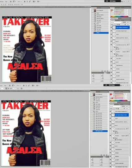 readers will have more of an idea of some the featuring artists in my magazine
as well as some of the other magazine’s contents. I also decided to move the publishing
date for my magazine to below to the masthead; this was so I could add in a
strap line. The reason I decided to use a strapline is because straplines are
known for being a type of catchphrase for your business. They are most commonly
seen in adverts and on large signs; but can also be useful for promoting a
business’ message. In Britain, straplines are md, and they are often called other
names, including ‘slogans’ and ‘taglines’. Therefore the ‘slogan’ for my music
magazine is: ‘SPECIAL EDITION 2015
MAXIMUM HOT 100’.
readers will have more of an idea of some the featuring artists in my magazine
as well as some of the other magazine’s contents. I also decided to move the publishing
date for my magazine to below to the masthead; this was so I could add in a
strap line. The reason I decided to use a strapline is because straplines are
known for being a type of catchphrase for your business. They are most commonly
seen in adverts and on large signs; but can also be useful for promoting a
business’ message. In Britain, straplines are md, and they are often called other
names, including ‘slogans’ and ‘taglines’. Therefore the ‘slogan’ for my music
magazine is: ‘SPECIAL EDITION 2015
MAXIMUM HOT 100’.
Cover Page Editing
Cover Editing

After getting
the idea of how I wanted my magazine front cover to look I, was able to send
the masthead of the page behind the main image. To do this I had to unlock the
background in order to send the masthead behind the model in order to increase
its underlying. However when I had done this there was a white line forming
around my models head, making the image look less real. So I then was able to
identify the exact color of her forehead and blend in the rest of her face without the white line forming. I also decided to do some research on
whereabouts prices are located on pages and found out that it all depends on
the actual price. Prices that are very low and cheap, are located on the page
somewhere the reader can instantly see it, almost as if the magazine is also
advertising the price. However since my magazine is £3.99, I decided to leave
the price above the bar code in a smaller fonts size.
Contents Editing
Contents Editing
From this
stage I added in the anchorage text for the image of Drake’s concert. Anchorage
text allows readers to know the meaning behind the picture being in the
magazine. As
 known from some research done, readers tend to look at the images
first especially for the age group my music magazine is aimed at. Therefore the
readers can find out some extra information for the specific artists or gossip
they are looking for from the image displayed.
known from some research done, readers tend to look at the images
first especially for the age group my music magazine is aimed at. Therefore the
readers can find out some extra information for the specific artists or gossip
they are looking for from the image displayed.
I also
changed the position of the anchorage text from my model’s image as I didn't want the page to look too constructed where everything is at an angle towards
the corner of another. I also decreased the size of the ‘Plus’ page numbers,
although I don’t know if I will be keeping it on the page as I can’t find the
right position to put it on my contents page.
Sunday, 8 February 2015
Contents Page Editing
Contents Page Editing
For my contents
page it took me a while to get to this stage, even though I had already drawn
up my plan and layout for every conventions I would use. After
finding the layout best

Content Page Editing
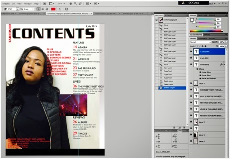 Now that I have got the layout that I can actually work with, I managed to copy all the text and masthead as well as
the small image i had on the side onto this page. I was finding it hard to make
both contents page and cove page flow together at first, but once I managed to
add a color gradient of grey to the background for some reason I thought it
looked 100 times better. I also changed the color of my masthead from red to
black but kept the TAKEOVER as red. This was because I wanted the masthead of
the magazine to be represented as the logo for my contents page. Turning ‘CONTENTS’
from red to black would make it stand out more from the rest of the text so
that the readers are able to instantly know what the page will be about. From some
research that I had done on contents pages, I realized that almost all
publishers tend to use guidelines in order for their numbers to stay in line
with one another. Therefore I inserted some of my own so that the page would have
more structure.
Now that I have got the layout that I can actually work with, I managed to copy all the text and masthead as well as
the small image i had on the side onto this page. I was finding it hard to make
both contents page and cove page flow together at first, but once I managed to
add a color gradient of grey to the background for some reason I thought it
looked 100 times better. I also changed the color of my masthead from red to
black but kept the TAKEOVER as red. This was because I wanted the masthead of
the magazine to be represented as the logo for my contents page. Turning ‘CONTENTS’
from red to black would make it stand out more from the rest of the text so
that the readers are able to instantly know what the page will be about. From some
research that I had done on contents pages, I realized that almost all
publishers tend to use guidelines in order for their numbers to stay in line
with one another. Therefore I inserted some of my own so that the page would have
more structure.
Subscribe to:
Posts (Atom)