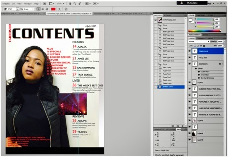
 Now that I have got the layout that I can actually work with, I managed to copy all the text and masthead as well as
the small image i had on the side onto this page. I was finding it hard to make
both contents page and cove page flow together at first, but once I managed to
add a color gradient of grey to the background for some reason I thought it
looked 100 times better. I also changed the color of my masthead from red to
black but kept the TAKEOVER as red. This was because I wanted the masthead of
the magazine to be represented as the logo for my contents page. Turning ‘CONTENTS’
from red to black would make it stand out more from the rest of the text so
that the readers are able to instantly know what the page will be about. From some
research that I had done on contents pages, I realized that almost all
publishers tend to use guidelines in order for their numbers to stay in line
with one another. Therefore I inserted some of my own so that the page would have
more structure.
Now that I have got the layout that I can actually work with, I managed to copy all the text and masthead as well as
the small image i had on the side onto this page. I was finding it hard to make
both contents page and cove page flow together at first, but once I managed to
add a color gradient of grey to the background for some reason I thought it
looked 100 times better. I also changed the color of my masthead from red to
black but kept the TAKEOVER as red. This was because I wanted the masthead of
the magazine to be represented as the logo for my contents page. Turning ‘CONTENTS’
from red to black would make it stand out more from the rest of the text so
that the readers are able to instantly know what the page will be about. From some
research that I had done on contents pages, I realized that almost all
publishers tend to use guidelines in order for their numbers to stay in line
with one another. Therefore I inserted some of my own so that the page would have
more structure.Sunday, 8 February 2015
Content Page Editing
 Now that I have got the layout that I can actually work with, I managed to copy all the text and masthead as well as
the small image i had on the side onto this page. I was finding it hard to make
both contents page and cove page flow together at first, but once I managed to
add a color gradient of grey to the background for some reason I thought it
looked 100 times better. I also changed the color of my masthead from red to
black but kept the TAKEOVER as red. This was because I wanted the masthead of
the magazine to be represented as the logo for my contents page. Turning ‘CONTENTS’
from red to black would make it stand out more from the rest of the text so
that the readers are able to instantly know what the page will be about. From some
research that I had done on contents pages, I realized that almost all
publishers tend to use guidelines in order for their numbers to stay in line
with one another. Therefore I inserted some of my own so that the page would have
more structure.
Subscribe to:
Post Comments (Atom)
No comments:
Post a Comment