Front Cover Editing
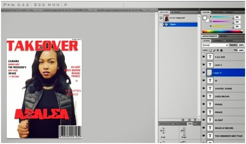 For my cover
page I decided to follow the house style I originally chose, which consisted of
grey, red and black. Since red was the most powerful color in the group I
thought it would be best to use it for the Masthead. This would make it easier
for readers to notice my magazine from far as well as make it eye catching. For
the text around my model I decided to type everything onto Microsoft Word first,
that way all of my text is saved in one place until I’m ready to add them onto
the pages needed. Since this is the first stage of me making the actual front
cover I just wanted to see where everything would look best. Therefore I decided
to add the featuring artists name around the lower centre, the bar code which is
typically at the bottom as well as the selling lines to be surrounding the
subject image. In order to stick to the house style I had
picked out i wanted the artists who will be in the selling lines to be in a
bold color so I suggested black and then the smaller text underneath them to
be in red , giving the readers a little bit of information of what will be in
the magazine.
For my cover
page I decided to follow the house style I originally chose, which consisted of
grey, red and black. Since red was the most powerful color in the group I
thought it would be best to use it for the Masthead. This would make it easier
for readers to notice my magazine from far as well as make it eye catching. For
the text around my model I decided to type everything onto Microsoft Word first,
that way all of my text is saved in one place until I’m ready to add them onto
the pages needed. Since this is the first stage of me making the actual front
cover I just wanted to see where everything would look best. Therefore I decided
to add the featuring artists name around the lower centre, the bar code which is
typically at the bottom as well as the selling lines to be surrounding the
subject image. In order to stick to the house style I had
picked out i wanted the artists who will be in the selling lines to be in a
bold color so I suggested black and then the smaller text underneath them to
be in red , giving the readers a little bit of information of what will be in
the magazine.
No comments:
Post a Comment