Contents Editing
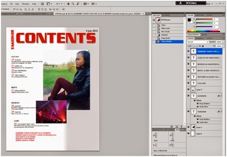
In order for my pages to flow together I decided to change
the color of my background and add a grey and white gradient,
which also fit with my house style. After this I could
see that the images were started to look better on the page but went fitting
together still. I also decided to change the typeface of the TAKEOVER and
CONTENTS to the same typeface of the magazine front cover, this way the pages
are more likely to flow together with each other though appearance. When it
came to the TAKEOVER I wanted to change its angle. This is because from
research that I've done I've seen
a few contents pages with this style and it seems to make them looks more
professional. I also wanted to make the size of all the text on this page
smaller to see if more text would be able to fit on the page.
No comments:
Post a Comment