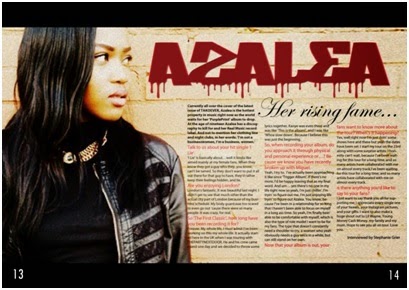
 After putting my background together , I then decided to add my text in using InDesign. The reason for the double page spread to have a question and
answer type of interview was because I found it easier to add in the colloquial language said by the ‘artist’. My double page spread contains columns,
which are separated into 3. These are there to separate the main body text so
that everything isn't clumped together. It also gives each paragraph and new
sentence a bit of space to make it seem easier to read from the audience’s
perspective. I believe the mise-en-scene in the background is able to reflect
on the artists, telling the audience what genre the artist is along with the
clothing and body language. The mise-en-scene is very important as the image
will be related to the main body text. From some research done I found out that
the color scheme for my double page spread can usually go both ways: it can
either follow the colors that are used on the front cover or it can be
completely different, as long as they’re reflecting the contents being
reflected. I decided to stick with the color scheme from my front cover, and
change the font typeface a little as this would make the reader’s attention
stick in my opinion. The image I used for my double pager spread I was able to
take a medium close up shot of my model with her more to the left side of my
camera so that the actual picture would be able to take up the entire left hand
side of the page.
After putting my background together , I then decided to add my text in using InDesign. The reason for the double page spread to have a question and
answer type of interview was because I found it easier to add in the colloquial language said by the ‘artist’. My double page spread contains columns,
which are separated into 3. These are there to separate the main body text so
that everything isn't clumped together. It also gives each paragraph and new
sentence a bit of space to make it seem easier to read from the audience’s
perspective. I believe the mise-en-scene in the background is able to reflect
on the artists, telling the audience what genre the artist is along with the
clothing and body language. The mise-en-scene is very important as the image
will be related to the main body text. From some research done I found out that
the color scheme for my double page spread can usually go both ways: it can
either follow the colors that are used on the front cover or it can be
completely different, as long as they’re reflecting the contents being
reflected. I decided to stick with the color scheme from my front cover, and
change the font typeface a little as this would make the reader’s attention
stick in my opinion. The image I used for my double pager spread I was able to
take a medium close up shot of my model with her more to the left side of my
camera so that the actual picture would be able to take up the entire left hand
side of the page.Thursday, 5 February 2015
Double Page Spread Text
After putting my background together , I then decided to add my text in using InDesign. The reason for the double page spread to have a question and
answer type of interview was because I found it easier to add in the colloquial language said by the ‘artist’. My double page spread contains columns,
which are separated into 3. These are there to separate the main body text so
that everything isn't clumped together. It also gives each paragraph and new
sentence a bit of space to make it seem easier to read from the audience’s
perspective. I believe the mise-en-scene in the background is able to reflect
on the artists, telling the audience what genre the artist is along with the
clothing and body language. The mise-en-scene is very important as the image
will be related to the main body text. From some research done I found out that
the color scheme for my double page spread can usually go both ways: it can
either follow the colors that are used on the front cover or it can be
completely different, as long as they’re reflecting the contents being
reflected. I decided to stick with the color scheme from my front cover, and
change the font typeface a little as this would make the reader’s attention
stick in my opinion. The image I used for my double pager spread I was able to
take a medium close up shot of my model with her more to the left side of my
camera so that the actual picture would be able to take up the entire left hand
side of the page.
Subscribe to:
Post Comments (Atom)
No comments:
Post a Comment