Tuesday, 7 April 2015

What have you learnt about technologies from the process of constructing this product?
 Photoshop is an editing software manufactured
by Adobe Systems Inc. Whilst using this software I realised that it
allows users to manipulate and correct the colour on photos.
Photoshop opened my eyes to how many professionals are able to edit out
many of their mistakes without any of their audience realizing. However it
was a
very long process to get the handle of; from selecting a different layer each
time, to applying any effect I may have added. There were many tools on
Photoshop that I had to get used to in order to perfect my skills. 2 of the
main tools that I think I used the most were the ‘Move Tool’ and the ‘Magic
Wand Tool’. Since i was always inserting objects, I had to become an expert at
what these two tools could do. As well as the outline tool that let me cut out
bits of an image that I didn't want included. I have to think that
Photoshop was the software that most of my music magazine was made, and has
helped me greatly makes my magazine seem more professional.
Photoshop is an editing software manufactured
by Adobe Systems Inc. Whilst using this software I realised that it
allows users to manipulate and correct the colour on photos.
Photoshop opened my eyes to how many professionals are able to edit out
many of their mistakes without any of their audience realizing. However it
was a
very long process to get the handle of; from selecting a different layer each
time, to applying any effect I may have added. There were many tools on
Photoshop that I had to get used to in order to perfect my skills. 2 of the
main tools that I think I used the most were the ‘Move Tool’ and the ‘Magic
Wand Tool’. Since i was always inserting objects, I had to become an expert at
what these two tools could do. As well as the outline tool that let me cut out
bits of an image that I didn't want included. I have to think that
Photoshop was the software that most of my music magazine was made, and has
helped me greatly makes my magazine seem more professional.
InDesign was the
hardest program I used during my magazine creation, although
I didn't use it as much as
Photoshop. Adobe InDesign is a desktop publishing software
application; it can be used to create posters, magazines,
newspapers. Whilst suing InDesign I realised that it was the perfect
software for applying text to any picture of background. It allows the text of
my music magazine to seem more realistic, through the layout and structure.
With the help of the guidelines I was able to insert on my front cover the
cover lines where all align with each other on both sides of the page, making
it seem more professional.

 A popular website I was able to find online was
‘PicMonkey’. PicMonkey is an online editing website which allows uploading any
image from your computer and editing them with a given range of effects. I
think that this website gave me and escape from Photoshop, and was a quick and
simple way of quickly edit an image that I thought needed to be portrayed
differently to my target readers. Once i had edited my images, PicMonkey also
gave me the option to share or save the image, I decided to do both on social
media, this gave me the feedback I needed, whether the effect that I had chosen
was a good choice or not.
A popular website I was able to find online was
‘PicMonkey’. PicMonkey is an online editing website which allows uploading any
image from your computer and editing them with a given range of effects. I
think that this website gave me and escape from Photoshop, and was a quick and
simple way of quickly edit an image that I thought needed to be portrayed
differently to my target readers. Once i had edited my images, PicMonkey also
gave me the option to share or save the image, I decided to do both on social
media, this gave me the feedback I needed, whether the effect that I had chosen
was a good choice or not. When it came to presenting my evaluation in various ways,
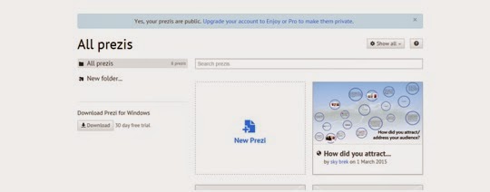
Prezi was a presentation website that I had come across, which allowed me to
display my work in an eye-catching mind map. I think that Prezi also helped me
a lot, as it enables the readers the say interested through the different
designs and colour of my own choice. With the help of Prezi I
was also able to upload images that would help the readers imagine what the
context is about or trying to portray. After making the mind map I was
fortunately given the options to share and save my mind map which would allow
any other person interested in media, which thought as a great way of expanding
its target market.
When it came to presenting my evaluation in various ways,
Prezi was a presentation website that I had come across, which allowed me to
display my work in an eye-catching mind map. I think that Prezi also helped me
a lot, as it enables the readers the say interested through the different
designs and colour of my own choice. With the help of Prezi I
was also able to upload images that would help the readers imagine what the
context is about or trying to portray. After making the mind map I was
fortunately given the options to share and save my mind map which would allow
any other person interested in media, which thought as a great way of expanding
its target market.
Blogger was the main source of keeping track of all of my
work, it help me whenever I didn't know what was needed to be done or even what
had been done already. It was a checklist of my progress, and showed me how to
publish my work online. I was also able to categorize my work into
subheading, such as homework and class work, which helped a lot when it
came to fine missing work that had to be completed. I was also found out how to
make various blogs depending on the content I could even give them different
titles and URLs.
Sunday, 1 March 2015

Thursday, 26 February 2015
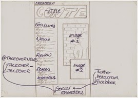
Plans I Didnt Follow
Plans I didn't follow
The most obvious decision that I wasn't able to follow
was the drawn up plans I had made as an over view of what my finished products would
have looked at. The main reason that I think I didn't stick to these drawing is
because of how simple they looked. I don’t think that I included nor had a
clear idea of how much I would actually need to put into each of them.
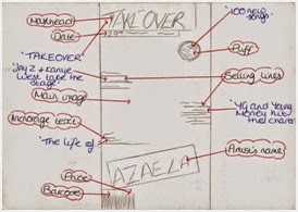 For my front cover drawn plan I included quite a few
conventions such as masthead, puff and selling lines. However when it came to actually
producing it I wasn't able to include all of them, I was probably thinking that
the front cover would look too informative on just one page and decrease its
professionalism. Therefore I didn't include the puff and instead added more selling lines as that is key for a front cover page as well as a ‘plus’. The
main reason for this was, because of the magazines that I had used for
inspiration all had clean cut images. For this reason, I too wanted my magazine
to have a clean cut image for its brand, which I also think is good for my
target readers as they are young adults, I didn't think that a lot of information would be needed. As you get older I think that interpreting what
the magazine is about comes easier. For example if Jay Z is on a magazine the magazine
is more likely to also include his daughter or Beyoncé and therefore the selling lines would need to be put on. However for if
it’s a magazines for young children then more would need to be put on the front
in order to keep them interested.
For my front cover drawn plan I included quite a few
conventions such as masthead, puff and selling lines. However when it came to actually
producing it I wasn't able to include all of them, I was probably thinking that
the front cover would look too informative on just one page and decrease its
professionalism. Therefore I didn't include the puff and instead added more selling lines as that is key for a front cover page as well as a ‘plus’. The
main reason for this was, because of the magazines that I had used for
inspiration all had clean cut images. For this reason, I too wanted my magazine
to have a clean cut image for its brand, which I also think is good for my
target readers as they are young adults, I didn't think that a lot of information would be needed. As you get older I think that interpreting what
the magazine is about comes easier. For example if Jay Z is on a magazine the magazine
is more likely to also include his daughter or Beyoncé and therefore the selling lines would need to be put on. However for if
it’s a magazines for young children then more would need to be put on the front
in order to keep them interested.

 I would have
to say that my contents page was the page that I had the most time struggling
with. I knew from the beginning that once I couldn't find the right picture to
use for my content page that I would be able to stick with the plan. At first I
planned on on having one picture on the side with text all around it, but then
afterwards I started finding it hard to choose a background color. Therefore I
decided to do some research and found out that most pictures taken by professional
as use the background they've been given and just edit it, to make it brighter
or fit the concept, which is what I decided to do. This also meant that I couldn't stick to the planned schedule I had made either as I had to recall the
model I had used and retake some pictures. Once I had decided to use the
background from the picture, because of the position of my model in the photo I
had to also change the position of the text I would later on include.
I would have
to say that my contents page was the page that I had the most time struggling
with. I knew from the beginning that once I couldn't find the right picture to
use for my content page that I would be able to stick with the plan. At first I
planned on on having one picture on the side with text all around it, but then
afterwards I started finding it hard to choose a background color. Therefore I
decided to do some research and found out that most pictures taken by professional
as use the background they've been given and just edit it, to make it brighter
or fit the concept, which is what I decided to do. This also meant that I couldn't stick to the planned schedule I had made either as I had to recall the
model I had used and retake some pictures. Once I had decided to use the
background from the picture, because of the position of my model in the photo I
had to also change the position of the text I would later on include. 
Producing the
double page spread was the easiest part for me, I think I was able to keep to the drawn plan I
had and include some things here and there. For example sticking to the position of where to place the interview of my featuring artists as well as well image
to go behind as the background as well, managed to fit fit perfectly together.
Tuesday, 24 February 2015


Wednesday, 18 February 2015
Front Cover Editing
Front Cover Editing
In order to make my front cover more appealing, all I had
left to do was add some more selling lines towards the top side of the models
face, this way the page will look more full and informative. I also researched
and saw that on the front cover that I used as inspiration; most front covers
had puffs or a plus. When it came to deciding where on my front cover the
‘Plus’ text was going to go; I firstly went with positioning it just above
‘AZALEA’. However the background was of my models body warmer was black and
therefore clashed with the

Monday, 16 February 2015
Contents Page Editing
Contents Page Editing
In order for my contents page
and cover page to flow I decided to add the similar background covers for my
subheadings, and got rid of the black line at the bottom. After a while I didn't feel it was necessary that I had it, I think I was trying to make sure that
both my content page and double page spread flowed together nicely, however later
on I realised that my double page spread is the page which is supposed to stand
out the most as it contains the featuring artists on it. I also decreased the size
of my fonts, this way I can add more text onto the page and make it seem more
informative. Although when it came

Front Cover Editing
The final things
that I wanted to add to my front cover page were the saturated red around my headlines.
This way it’ll be easier for the reader’s to identify what the main content of
the magazine will be. I also edited ‘The Queen of Hip Hop’, giving it an outer glow;
this was because the background of some of this was black due to the models
cloths. So I thought

Contents Page Editing
After adding in the advertisement text
using InDesign, I decided to go back onto Photoshop and add a white box around
the text. From some research I’ve done on content page advertisements they tend
to make the text stand out from the rest, therefore I used a different typeface
as well as the color. I also looked at some examples that VIBE had

Double Page Editing
Double Page Editing
After looking
at my double page spread I realised that the black lines at the top and bottom
were a bit too thick, so I therefore decided to make them smaller. However in
order to do this I had to stretch the background picture which included the
actual model. I also changed the size of my strap line at the top of both pages
this way it would be more noticeable for the

Contents Page Editing
Contents Page Editing
For my
contents page I decided to add in a little advertisement at the bottom left
corner to make the page look more realistic, with the help of InDesign. From
some research I had done on what to advertise inside a magazine
most website had written how some magazines done advertise other business
products or service, but advertise an offer of their own for their readers,
this way the magazine would still be gaining more attention. I decided

Tuesday, 10 February 2015
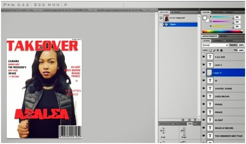
Cover Page Editing
Cover
Page Editing
Looking at my magazine’s front cover I was thinking that it was looking a bit too simple so I therefore decided to add some more selling lines around my models picture. This way, the
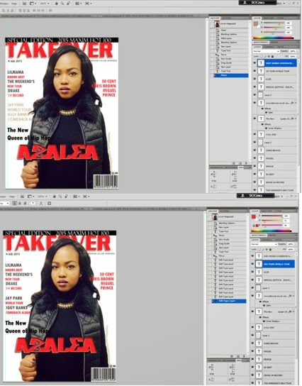 readers will have more of an idea of some the featuring artists in my magazine
as well as some of the other magazine’s contents. I also decided to move the publishing
date for my magazine to below to the masthead; this was so I could add in a
strap line. The reason I decided to use a strapline is because straplines are
known for being a type of catchphrase for your business. They are most commonly
seen in adverts and on large signs; but can also be useful for promoting a
business’ message. In Britain, straplines are md, and they are often called other
names, including ‘slogans’ and ‘taglines’. Therefore the ‘slogan’ for my music
magazine is: ‘SPECIAL EDITION 2015
MAXIMUM HOT 100’.
readers will have more of an idea of some the featuring artists in my magazine
as well as some of the other magazine’s contents. I also decided to move the publishing
date for my magazine to below to the masthead; this was so I could add in a
strap line. The reason I decided to use a strapline is because straplines are
known for being a type of catchphrase for your business. They are most commonly
seen in adverts and on large signs; but can also be useful for promoting a
business’ message. In Britain, straplines are md, and they are often called other
names, including ‘slogans’ and ‘taglines’. Therefore the ‘slogan’ for my music
magazine is: ‘SPECIAL EDITION 2015
MAXIMUM HOT 100’.
Cover Page Editing
Cover Editing

After getting
the idea of how I wanted my magazine front cover to look I, was able to send
the masthead of the page behind the main image. To do this I had to unlock the
background in order to send the masthead behind the model in order to increase
its underlying. However when I had done this there was a white line forming
around my models head, making the image look less real. So I then was able to
identify the exact color of her forehead and blend in the rest of her face without the white line forming. I also decided to do some research on
whereabouts prices are located on pages and found out that it all depends on
the actual price. Prices that are very low and cheap, are located on the page
somewhere the reader can instantly see it, almost as if the magazine is also
advertising the price. However since my magazine is £3.99, I decided to leave
the price above the bar code in a smaller fonts size.
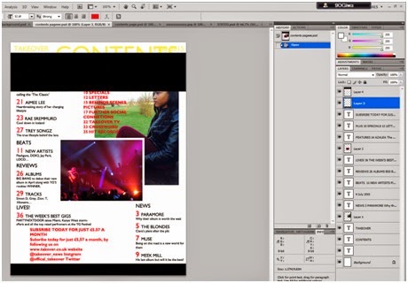
Contents Editing
Contents Editing
From this
stage I added in the anchorage text for the image of Drake’s concert. Anchorage
text allows readers to know the meaning behind the picture being in the
magazine. As
 known from some research done, readers tend to look at the images
first especially for the age group my music magazine is aimed at. Therefore the
readers can find out some extra information for the specific artists or gossip
they are looking for from the image displayed.
known from some research done, readers tend to look at the images
first especially for the age group my music magazine is aimed at. Therefore the
readers can find out some extra information for the specific artists or gossip
they are looking for from the image displayed.
I also
changed the position of the anchorage text from my model’s image as I didn't want the page to look too constructed where everything is at an angle towards
the corner of another. I also decreased the size of the ‘Plus’ page numbers,
although I don’t know if I will be keeping it on the page as I can’t find the
right position to put it on my contents page.
Sunday, 8 February 2015
Contents Page Editing
Contents Page Editing
For my contents
page it took me a while to get to this stage, even though I had already drawn
up my plan and layout for every conventions I would use. After
finding the layout best

Content Page Editing
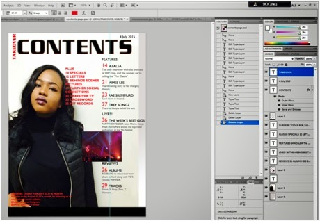 Now that I have got the layout that I can actually work with, I managed to copy all the text and masthead as well as
the small image i had on the side onto this page. I was finding it hard to make
both contents page and cove page flow together at first, but once I managed to
add a color gradient of grey to the background for some reason I thought it
looked 100 times better. I also changed the color of my masthead from red to
black but kept the TAKEOVER as red. This was because I wanted the masthead of
the magazine to be represented as the logo for my contents page. Turning ‘CONTENTS’
from red to black would make it stand out more from the rest of the text so
that the readers are able to instantly know what the page will be about. From some
research that I had done on contents pages, I realized that almost all
publishers tend to use guidelines in order for their numbers to stay in line
with one another. Therefore I inserted some of my own so that the page would have
more structure.
Now that I have got the layout that I can actually work with, I managed to copy all the text and masthead as well as
the small image i had on the side onto this page. I was finding it hard to make
both contents page and cove page flow together at first, but once I managed to
add a color gradient of grey to the background for some reason I thought it
looked 100 times better. I also changed the color of my masthead from red to
black but kept the TAKEOVER as red. This was because I wanted the masthead of
the magazine to be represented as the logo for my contents page. Turning ‘CONTENTS’
from red to black would make it stand out more from the rest of the text so
that the readers are able to instantly know what the page will be about. From some
research that I had done on contents pages, I realized that almost all
publishers tend to use guidelines in order for their numbers to stay in line
with one another. Therefore I inserted some of my own so that the page would have
more structure.Content Editing
Contents Editing
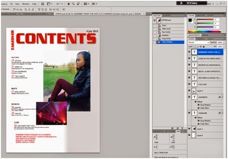
In order for my pages to flow together I decided to change
the color of my background and add a grey and white gradient,
which also fit with my house style. After this I could
see that the images were started to look better on the page but went fitting
together still. I also decided to change the typeface of the TAKEOVER and
CONTENTS to the same typeface of the magazine front cover, this way the pages
are more likely to flow together with each other though appearance. When it
came to the TAKEOVER I wanted to change its angle. This is because from
research that I've done I've seen
a few contents pages with this style and it seems to make them looks more
professional. I also wanted to make the size of all the text on this page
smaller to see if more text would be able to fit on the page.
Content Editing
Content Editing
 For my contents
page I was finding it hard to make all of the actual content fit the layout I had originally planned. So therefore, I wanted to use this Photoshop to put all
the conventions and text will be using on the contents page just to see how
everything looks on the page. Firstly I was struggling with
the pictures that I wanted to put onto my contents page because I noticed that
the colors were contrasting each other a lot. And for this reason I didn't know
where my text would go either because I wanted to position my images first and
the put the text in their place.
For my contents
page I was finding it hard to make all of the actual content fit the layout I had originally planned. So therefore, I wanted to use this Photoshop to put all
the conventions and text will be using on the contents page just to see how
everything looks on the page. Firstly I was struggling with
the pictures that I wanted to put onto my contents page because I noticed that
the colors were contrasting each other a lot. And for this reason I didn't know
where my text would go either because I wanted to position my images first and
the put the text in their place. Front Cover Editing
Front Cover Editing
 For my cover
page I decided to follow the house style I originally chose, which consisted of
grey, red and black. Since red was the most powerful color in the group I
thought it would be best to use it for the Masthead. This would make it easier
for readers to notice my magazine from far as well as make it eye catching. For
the text around my model I decided to type everything onto Microsoft Word first,
that way all of my text is saved in one place until I’m ready to add them onto
the pages needed. Since this is the first stage of me making the actual front
cover I just wanted to see where everything would look best. Therefore I decided
to add the featuring artists name around the lower centre, the bar code which is
typically at the bottom as well as the selling lines to be surrounding the
subject image. In order to stick to the house style I had
picked out i wanted the artists who will be in the selling lines to be in a
bold color so I suggested black and then the smaller text underneath them to
be in red , giving the readers a little bit of information of what will be in
the magazine.
For my cover
page I decided to follow the house style I originally chose, which consisted of
grey, red and black. Since red was the most powerful color in the group I
thought it would be best to use it for the Masthead. This would make it easier
for readers to notice my magazine from far as well as make it eye catching. For
the text around my model I decided to type everything onto Microsoft Word first,
that way all of my text is saved in one place until I’m ready to add them onto
the pages needed. Since this is the first stage of me making the actual front
cover I just wanted to see where everything would look best. Therefore I decided
to add the featuring artists name around the lower centre, the bar code which is
typically at the bottom as well as the selling lines to be surrounding the
subject image. In order to stick to the house style I had
picked out i wanted the artists who will be in the selling lines to be in a
bold color so I suggested black and then the smaller text underneath them to
be in red , giving the readers a little bit of information of what will be in
the magazine.Friday, 6 February 2015
My Concert Picture
My Concert Picture
Since the pictures on my contents page have to take up most of the actual page I found it hard to find a second model to take a picture of, thankfully last year I was went one of Drake’s concerts. However I did delete a lot of my pictures from my album, so I had to go back onto my Instagram Account to find one my pictures taken. Once I had found the image I decided to ask some people if me taking a picture of someone close to me or using the picture of Drake’s concert would be better.


Thursday, 5 February 2015
Double Page Spread Text
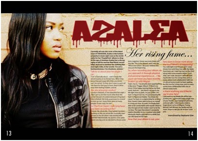 After putting my background together , I then decided to add my text in using InDesign. The reason for the double page spread to have a question and
answer type of interview was because I found it easier to add in the colloquial language said by the ‘artist’. My double page spread contains columns,
which are separated into 3. These are there to separate the main body text so
that everything isn't clumped together. It also gives each paragraph and new
sentence a bit of space to make it seem easier to read from the audience’s
perspective. I believe the mise-en-scene in the background is able to reflect
on the artists, telling the audience what genre the artist is along with the
clothing and body language. The mise-en-scene is very important as the image
will be related to the main body text. From some research done I found out that
the color scheme for my double page spread can usually go both ways: it can
either follow the colors that are used on the front cover or it can be
completely different, as long as they’re reflecting the contents being
reflected. I decided to stick with the color scheme from my front cover, and
change the font typeface a little as this would make the reader’s attention
stick in my opinion. The image I used for my double pager spread I was able to
take a medium close up shot of my model with her more to the left side of my
camera so that the actual picture would be able to take up the entire left hand
side of the page.
After putting my background together , I then decided to add my text in using InDesign. The reason for the double page spread to have a question and
answer type of interview was because I found it easier to add in the colloquial language said by the ‘artist’. My double page spread contains columns,
which are separated into 3. These are there to separate the main body text so
that everything isn't clumped together. It also gives each paragraph and new
sentence a bit of space to make it seem easier to read from the audience’s
perspective. I believe the mise-en-scene in the background is able to reflect
on the artists, telling the audience what genre the artist is along with the
clothing and body language. The mise-en-scene is very important as the image
will be related to the main body text. From some research done I found out that
the color scheme for my double page spread can usually go both ways: it can
either follow the colors that are used on the front cover or it can be
completely different, as long as they’re reflecting the contents being
reflected. I decided to stick with the color scheme from my front cover, and
change the font typeface a little as this would make the reader’s attention
stick in my opinion. The image I used for my double pager spread I was able to
take a medium close up shot of my model with her more to the left side of my
camera so that the actual picture would be able to take up the entire left hand
side of the page.Double Page Spread Background

Double page spreads are used to expand
on some of the articles that were mentioned on the front cover of the magazine.
They usually include a large image that covers most of the page and little text
is used so that the attention is mainly on the image. These spreads can also be
used for advertisements as readers will be able to look at the advertisement
without getting distracted by any other pages. At this stage of my double page spread, I have only managed to add the
background which is my model leaning against a brick wall with the masthead spread across the top. When it came to editing my double page spread image, I decided to use Cinerama edit. This allowed my picture to look more dusk and urban. I think this allowed my models expression to stand out more as artists who are in the Hip Hop industry always have on a serious facial expression, which would allow my target readers to hopefully denote the music genre. From this point of view I can see clearly where the text
for my double page spread will be as well as the page numbers. Since the house style is red and black and white I wanted the pages to flow by making the
masthead red as well as the questions that i'll be typing this page.
Page Text

When it came
to the text on my double page spread I wanted to type it all up in one place first
so I can save it as I went along, after this I will then use InDesingn to copy my text onto my pages. Even though the text on the double page spread isn't that important as the rest of magazine, I wanted to present it as a question
and answer type of interview. For the grammar of my interview, after research
based on magazine interview I found out that the writers keep the writing colloquial,
this enabled the readers to feel more comfortable in reading the content on the
double page spreads as well interested. I also managed to type up the text for
my contents page, as every contents page has headings such as: Feature, News,
Reviews, Beats, Lives and Plus.
Wednesday, 4 February 2015
Contents Page Editing
Contents Page Editing
For my
contents page I because my music genre is Hip Hop, I research a lot of magazine
contents page to see how they’re presented and organised. From the images I saw
as well as the information I read, most contents page had one a background
image of the main celebrity featuring in the magazine.
I thought that this would be a good idea, as the contents page would help give the readers more of the idea of Hip Hop if my cover page wasn't good enough. However due to the mark scheme as well as the layout plan I had already put together I thought I should stick to layouts similar to these.
For the contents image I decided to use one of the images I took of my model sitting down in a park near by. Since it was the contents page I didn't really want the image to stand out that much compared to by cover page and double page spread. I therefore used the online editing website on the internet called Pic Monkey. Since I aimed for my contents page to be slightly dark, I also wanted the picture to blend in, so I increased the contrasting light in the picture.

Thursday, 29 January 2015
Double Page Editing
DOUBLE PAGE EDITING
When it came
to my double page spread I found extremely hard, this is because whilst I was
taking my pictures I didn't know at the time that I had to take pictures that
had space on one side of them for the actual text. Later on I found out that
there was something that I could on Photoshop that would allow me to stretch
the background of my picture, making it suitable for a double page spread
image. When it came to editing my picture I found an effect that would make my
photo look more artistic toward more music genre. However when I used the
effect it showed up like this:

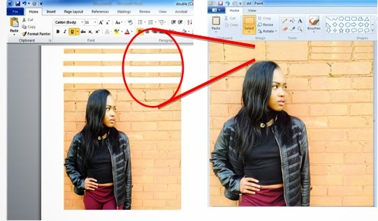 The problem with this is that I don’t think that it as
effective as the readers wouldn't actually be able to see the models face in
this image. So I decided to use some of the wall above the models head in order
to see the models face I when I use the effect again. I used Microsoft Word to copy and paste 3 layers of the wall onto the top, and then grouped all of the together onto Paint in order to save he image as one.
The problem with this is that I don’t think that it as
effective as the readers wouldn't actually be able to see the models face in
this image. So I decided to use some of the wall above the models head in order
to see the models face I when I use the effect again. I used Microsoft Word to copy and paste 3 layers of the wall onto the top, and then grouped all of the together onto Paint in order to save he image as one.
After creating
the background with the extra layers added on top, I was also able to stretch
out the side of the image as I realized that I hadn't taken a correct picture where there is enough room on either side of my model to
actually put the text. I decided to use this final effect on my picture as it
made the model fit into the genre off my magazine: where the artist is seen
with a facial expression that relates to their music. I also done some research
and realized that double page spreads in every magazine are completely
different to the rest of the magazine, therefore I wanted this page to stand
out by making it look more artistic, in a way.
Cover Page Editing
COVER PAGE EDITING
After coming to a conclusion on the pictures I’m going to
use, I decided to keep a track on how I came about editing my pictures to fit
the magazines genre.
 I decided to
use an online website to tint the picture slightly, making the background look
a little bit grey I thought that this would make my model’s expression stand
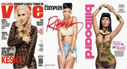
out more, making her look more serious. However i then done some research about
the type on background color that is most often chosen, and for hip hop
especially female artists it tends to be white. As seen from the photos of magazine covers below, the white background firstly makes it stand out to
readers and catch their attention. As well as helping the artists themselves to
stand out also. The white background helps to create a sense of wealth with
high standards, yet powerful as the color also emphasizes their facial
expressions:
I decided to
use an online website to tint the picture slightly, making the background look
a little bit grey I thought that this would make my model’s expression stand
out more, making her look more serious. However i then done some research about
the type on background color that is most often chosen, and for hip hop
especially female artists it tends to be white. As seen from the photos of magazine covers below, the white background firstly makes it stand out to
readers and catch their attention. As well as helping the artists themselves to
stand out also. The white background helps to create a sense of wealth with
high standards, yet powerful as the color also emphasizes their facial
expressions:
Unfortunately behind my model there was also a door knob in the picture, which I had to cover
with the background original color and then blend it in with the rest.
 I decided to
also to get rid of the shine in the picture as well as on my models face, this
way the picture with look more professional and taking in a studio with the
right equipment. Since this picture is for my front cover I also made some more
space on the right side of my model so that there would be enough room to fit
some text in.
I decided to
also to get rid of the shine in the picture as well as on my models face, this
way the picture with look more professional and taking in a studio with the
right equipment. Since this picture is for my front cover I also made some more
space on the right side of my model so that there would be enough room to fit
some text in. Wednesday, 21 January 2015
My Photoshoot
The Photo Shoot
Where it came to actually
taking the picture for my magazine, I wanted the lighting to be bright so I
therefore asked people on social media as well as email to as for their
opinions on my location as well as the time of day that would be best for the
pictures.

Based on the opinions I
received from people, I decided to take some of the pictures in a near by park
as most of the people I asked had mentioned that there is quite a few spots
where graffiti can be seen. They also mentioned that I should take my pictures
in my house, just in case the pictures taken outside don't capture the lighting
as good.

Once looking through my
pictures I did notice some things that were going wrong such as the weather on
the actual day wasn't as good as I had hoped since it was a bit too cloudy. There
was also a lot of wind on the day and therefore the models hair was blowing all
over the place


Subscribe to:
Comments (Atom)